Portfolio Website Design
Developed using HTML5, this project highlights my portfolio work in a functional responsive website designed for both browser and mobile formats.
The main objective is to showcase a variety of my work in a professional, elegant, and straightforward manner.

The Website Contains 7 Pages Total
Homepage
Landing page with highlights of work
4 Supplementary pages
Interactive work
Photography work
Videography work
About me page
2 Sub-content pages
Slow Draw Interactive Installation
One Step Interactive Installation
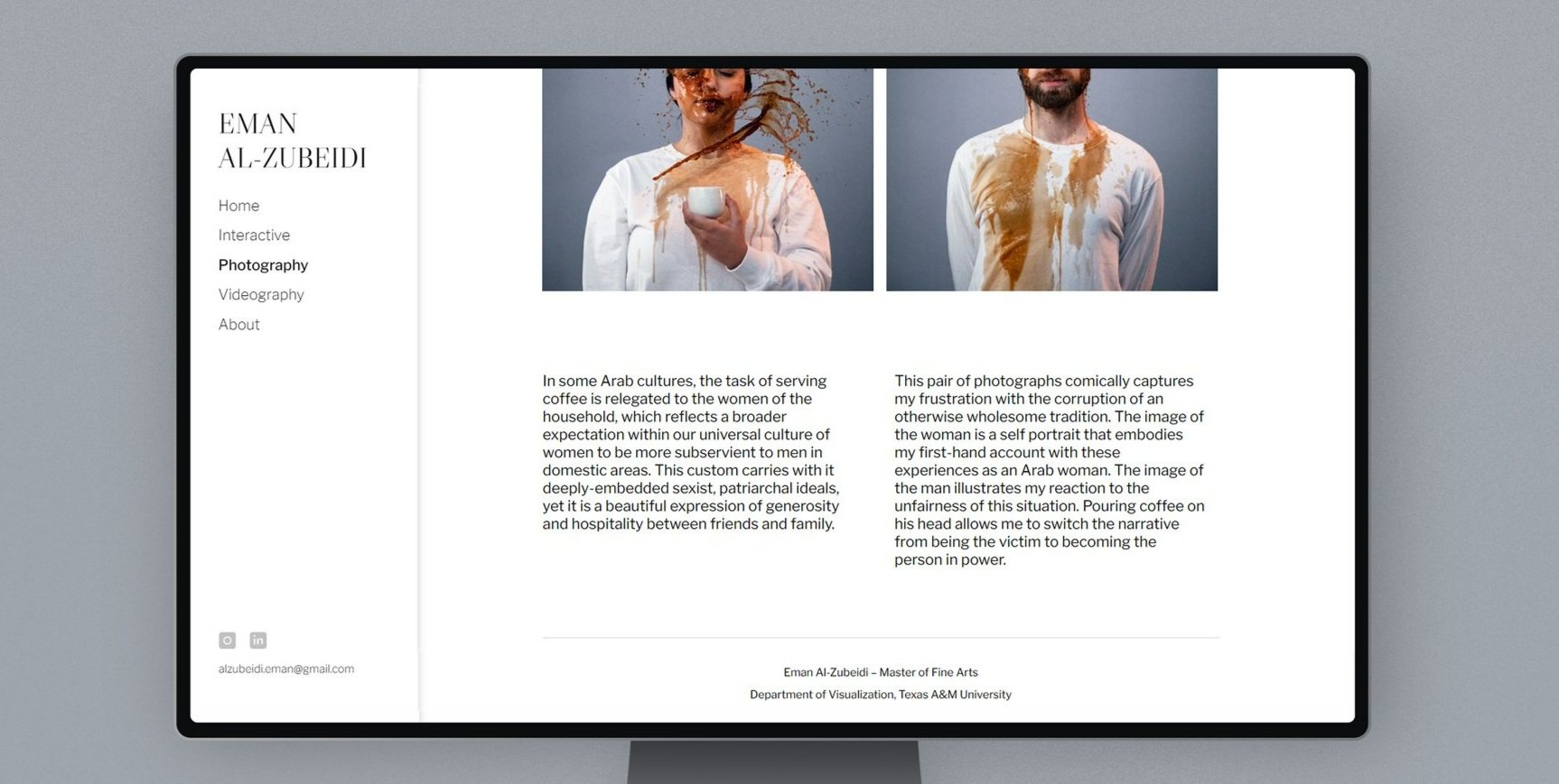
The Design is Simple, Minimalist, and Clean
The website utilizes negative space and a black and white palette to serve as a blank canvas for a diverse collection of portfolio work. Though the website design involves thin lines, minimal icons and slow animations, each website design element takes a back seat in order to shine the spotlight on portfolio work.
One sans serif font is used throughout the website to emphasize simplicity. To grab the user’s attention, my name is fixed in the top left corner of the page situating itself as the first element to be seen following the F-shaped reading pattern. My name also stands out as the only serif and upper caps text.
The simplicity of the design provides flexibility to represent each medium in a unique yet consistent way.

Fixed Header and Navigation
It is crucial to keep my name and navigation visible at all times during the user experience. My contact information and social links are also fixed in the header for easier accessibility.
Responsive Main Content
All the main content on the website is arranged in a 2-column or 3-column grid layout. The design transforms into a 1-column layout for mobile format which accounts for better readability.
To encourage user interaction, I scattered responsive animations throughout the website.
Link Hover Animation
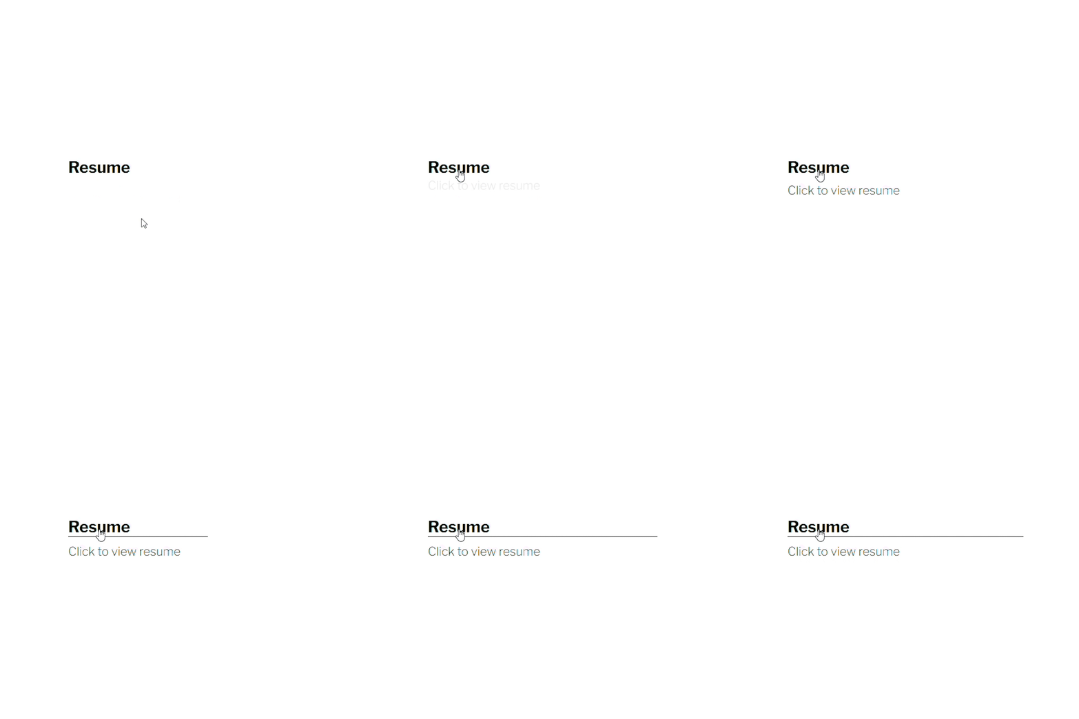
On link hover, the text turns bold while a line smoothly animates underneath the it using ease-in and out motion. This is achieved by adding a bottom border to the link and animating the width using a cubic bezier curve.
Image Hover Animation
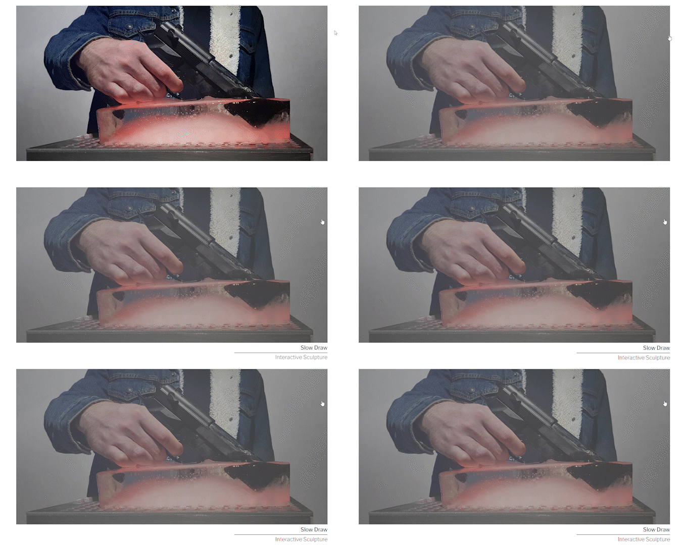
A hover animation is applied to images when projects are displayed in a gallery layout. On hover, a grey tint overlaps the image while text slides down and fades in underneath the image to reveal the project title.
Tooltip Animation
To reveal additional information about a project’s exhibition record, an image and text slide down and fade in consecutively underneath. Similarly, additional instruction is provided when users hover over “Resume” in the About page.
Conclusion
Though it was challenging to highlight diverse mediums that fit into one design layout, my main goal was to ensure the user experience is simple and straightforward by achieving the following objectives:
Utilize minimalist and consistent design
Provide accessible and clear navigation
Prompt user interaction via responsive animation


