Aura App Design
Aura is a mobile application that focuses on voice messaging and data visualization to translate the same simplicity a hug would. Sending long, emotional texts to loved ones can sometimes be time and energy consuming. Thus, Aura distills text messaging into thoughtful, visual, and clear communication.
The concept behind Aura stems from my personal struggle of being away from the home I grew up in. The mobile application design was developed in 2019, long before long-distance communication became an integral part of our everyday lives post-pandemic.
Challenges
Long distance relationships take extra effort to maintain, especially for working moms who are away from their children.
If you add the constraint of time-difference, it becomes almost impossible to find a good time to connect deeply.
it can be difficult to translate the simplicity of a hug using virtual communication.
Solutions
Aura utilizes voice messaging to make sending heartfelt and personal messages easier.
It focuses on data visualization for “emotional efficiency” during a busy day.
Through color psychology, the sender communicates their mood before the receiver hears the message, similar to the concept of reading body language.
Step 1. Researching References - What makes Aura unique?
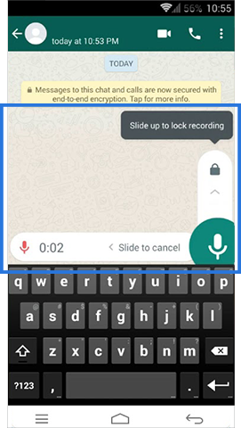
My first step involved gathering inspiration from What’s App, Messenger, and Snapchat to analyze what makes them some of the top ten global messaging apps.
Step 2. Creating a persona & drawing up a scenario - Who is my target user?
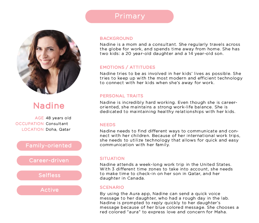
I chose to focus my primary and secondary personas on a mother (Nadine) and her daughter (Maha) to highlight how difficult it can be for a working mom to keep in touch with her daughter who is pursuing her graduate degree abroad.
Step 3. Figuring out the main user interface actions based on the application goals and objectives
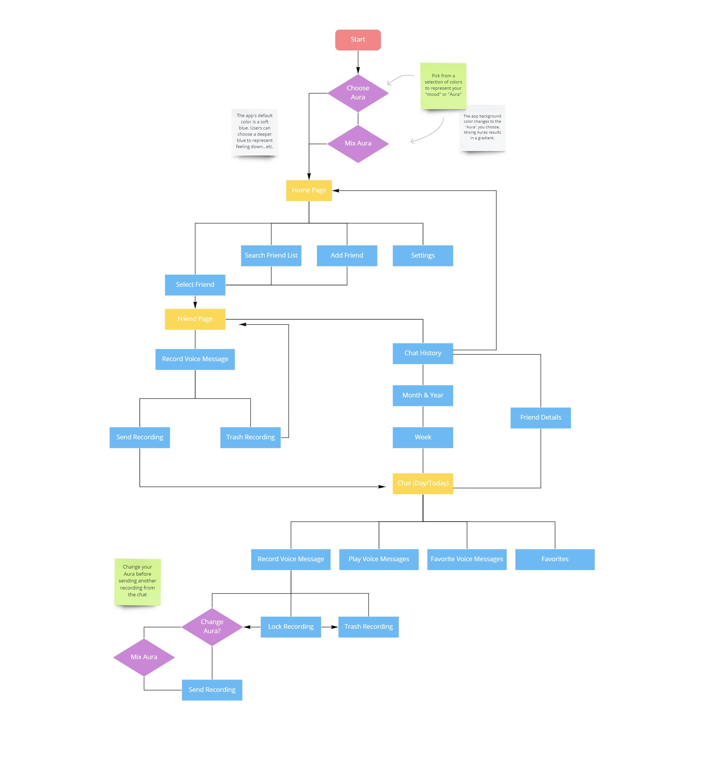
The flowchart above highlights Aura’s main objectives: visual and clear communication. Yellow rectangles indicate the main pages on the app.
Step 4. Creating a wireframe to establish basic assets and brainstorm navigation techniques
The wireframe below shows what the interface would look like when the user picks an “aura” color to represent their mood prior to selecting a friend to send a message to. The bottom row shows the additional feature of mixing an “aura”, or picking a two-tone color scheme to reflect complex emotions.
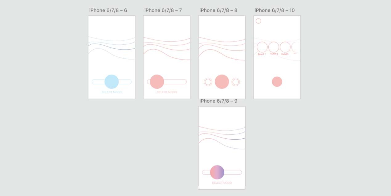
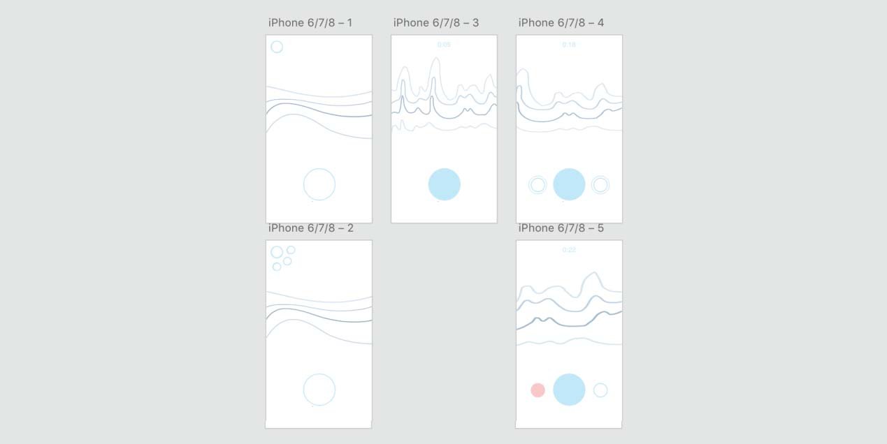
The remaining sketches show what the interface would look like when a user records a voice message or, indicated in the bottom row, deletes a message mid-recording and clicks on the settings menu button from the home page.
Step 5. Designing and developing a high fidelity prototype
The high fidelity prototype designs begin from the Home Page. Choosing an aura is not yet represented in the app prototype.
The app design is utilizes gradients, round shapes, and transparency to mirror the concept of emotional connection. The visual language used in the app, which aims to mimic non-verbal communication in real life, includes:
Choosing an Aura to set the tone of the message prior to listening to a recording via color language
Data visualization of chat history to help users navigate chats easier and understand the density of communication during specific timeframes
Final designs for Nadine’s prototype (mother’s point of view) - sending her daughter a message using a red “aura” represented as the color of the app’s background (image above).
Final designs for Maha’s prototype (daughter’s point of view) - receiving a message from her mother with a red “aura” represented as the red chat circle and voice message bubble (image above).
Step 6. Creating a functional prototype in Adobe XD
Nadine (mother) replies to her daughter’s message and picks a red “aura” to express her love and concern to Maha, who sent her a message after a long day at the lab.
Maha (daughter) is quickly reassured by her mother and understands how strongly her mother feels before listening to the message by noticing her soft red “aura”.
Conclusion
In the future, I would like to add the “choose your aura” feature to the working prototype, as well as implement an app shortcut on the mobile homepage, similar to the Facebook messenger chat bubble, to reinforce the efficiency of a one-tap send and receive message function and increase efficiency in long communication.
Due to Covid-19, we are becoming increasingly reliant on virtual communication. Thus, I would also like to revisit some objectives and introduce video chatting as a feature to the app. The ultimate goal is to refine the experience to ensure natural, intimate, and intuitive human connection through mobile communication.

